Back in September 2021, Cloudsmith raised $15 million in Series A funding for its cloud platform that manages companies’ software supply chains. At the time, that was the largest Series A round for a Northern Ireland company since 2005, so it definitely got something right! I was delighted to look over Cloudsmith’s deck to see how it did it. The deck included some redacted numbers, but there was still enough data to get a good picture.
We’re looking for more unique pitch decks to tear down; here’s how you to get involved. Read our 90+ Pitch Deck Teardowns here.
Slides in this deck
The presentation has 36 slides — 25 make up the main deck, eight are in the appendix and three are addenda. While it is substantial, there is room for improvement. For example, I’d remove unnecessary slides like the organizational chart (nobody cares and certainly not in an intro deck) and combine similar slides, such as the competition and competitor pricing slides. While there is much to appreciate about the deck, let’s take a closer look to identify other areas for refinement.
- Cover slide
- Mission
- Summary
- Problem / cause slide
- Problem / impact slide
- Solution — logistics slide
- Solution — Cloudsmith slide
- Case study
- Accumulating trust slide (customer list)
- Product slide
- Ecosystem slide
- Positioning slide
- Customer segmentation slide
- Go-to-market slide
- Market size slide
- Market penetration map slide
- Traction slide
- Forecast slide
- Pricing slide
- Partners slide
- Organization chart
- People slide (team)
- Use of funds slide
- Raising Series A (ideal investor slide)
- Closing slide
- Appendix interstitial
- Roadmap
- Product
- Target logos
- Competition
- “Why we win“
- “What’s your dream?“
- Competition pricing
- Addendum interstitial
- Net revenue retention
- Growth plan
Three things to love about Cloudsmith’s pitch deck
Cloudsmith originally submitted its deck months ago, and every time I looked at it, I was frustrated by how much of the deck was redacted. It was hard to get a feeling for what impressed its investors to hand over the cash. But there’s still a lot to learn, even with information missing, so I decided to dive in. (Hey, startup founders: This is your very unsubtle hint to submit your own deck to the Pitch Deck Teardown series!)
Here are some slides that I liked:
A promising summary

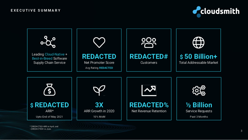
The summary slide for Cloudsmith effectively sets the stage for a comprehensive and enticing company overview. It functions as an engaging opener within the pitch deck, designed to clearly articulate what Cloudsmith does and its impressive performance to date. This all but ensures that potential investors understand the promising nature of the opportunity from the get-go.
This slide captures the essence of Cloudsmith’s operations and achievements in a compact yet potent format. It presents key information that informs and excites, creating a compelling case for why investment is not only an opportunity but also a strategic move for those looking to capitalize on emerging tech trends.
Although some figures are redacted, the visible metrics are quite promising, suggesting strong performance and potential. Even the redacted portions are “correct.” It’s a little sus to hide your NPS (net promoter score) — come on, that’s hardly a business secret — but you definitely want to show your ARR (annual recurring revenue), MRR (monthly recurring revenue), number of customers, etc.
However, the slide could be even more effective by including the financial “ask”: how much capital Cloudsmith is seeking and what the funds will be used for. Detailing the specific use of funds could help bridge the gap between investor interest and action, making a stronger case for why an investment now could be pivotal for Cloudsmith’s trajectory — and help build a little FOMO right out of the gate.
What’s now? What’s next?

The remarkable “Now and Next” slide is a dynamic way to show the company’s substantial achievements and ambitious future plans. This slide artfully blends past triumphs with aspirations for growth, providing investors with a captivating narrative.
The slide illustrates Cloudsmith’s capabilities and solid foundation. It articulates the company’s practical benefits, simplifying complex technical concepts for investors. This clarity ensures that even those unfamiliar with the technical intricacies can grasp the significant value Cloudsmith brings to its customers.
Transitioning from the present to the future, the slide invites investors to embark on a shared vision with the company. The outlined expansion plans are not just about growth; they are also about leveraging existing strengths to build a thriving future.
Cloudsmith’s plans are not really detailed enough to be fully credible, however; this slide evokes my “Sure, yeah, and how are you going to do that?” snark. But I’m certainly paying attention at this point, and loving the forward-looking hint at the substantial growth the company is envisioning.
Helloooooo, traction

The best form of traction is revenue, and Cloudsmith has a graph displaying its ARR from August 2019 to April 2021, which looks healthy. Now, as the numbers are redacted, I can’t be certain exactly how healthy, but the graph is pointing in the right direction, and Cloudsmith knew that it needed to share those figures.
The company also included other useful metrics on its traction slide, indicating customer numbers, LTV (lifetime value) and CAC (customer acquisition cost), among others. Again, the figures are redacted, but assuming they’re healthy, this is a good example of what to include on a traction slide. There are no vanity metrics, and it’s not trying to use a crystal ball to look into the future, which by definition isn’t traction.
Now, given that this is a Series A financing, we’re talking about growth here, and most growth rounds are done exclusively on traction. If you have it, the fundraise will be pretty straightforward. If you don’t, well, you’re in for a tough time. So I have to ask: Why are we only getting this chart on slide 17? If this were my pitch deck, this would be slide 3 or 4; this is exponential growth(ish), and looking great. Lead with that!!
Three things that Cloudsmith could have improved
Before you start flinging your deck into the general direction of VCs, take a beat. Examine each slide in your deck. Ask yourself, “Does this slide actually help raise cash?” If not, ditch it. Sometimes, less is more. One killer slide can pack a bigger punch than a couple of lackluster ones. Trim the fat and keep your audience hooked on what really matters: your fundraising goals.
A quick shuffle that would help trim the fat and streamline the deck:
- Delete slides 2, 21, 24, 29, and 32.
- Merge slides 30 and 33, then move to the main deck and create single, better problem and solution slides.
- Move slide 8 to the appendix and slides 28 and 31 to the main deck.
OK, with that reshuffle out of the way.
Two solution slides? Are you sure about that?

Let’s get real about solution slides: They’re supposed to be your strategic ace up your sleeve, not a deep dive into the nitty-gritty. They should give a bird’s-eye view of how your company plans to tackle the big, bad problem you’ve laid out. But here we are, with two slides that seem to have forgotten their purpose in life and are lost deep in the weeds. It’s like Cloudsmith is trying to show off how much it knows rather than focusing on the strategic overview. Keep it high level, folks.
There’s slide 6, strutting around with its three boxes that scream, “I’m useful!” but whisper, “I’m not solving anything.” Sure, it’s packed with info, but it’s like that guest at the party who talks a lot but doesn’t really say anything important (I know this all too well, because I’m frequently that guest, but hear me out). These boxes might feel good about themselves, but they’re not doing the job of moving us toward a solution. It’s time to refocus and make sure every element on that slide is there to contribute to the solution, not just to take up space.
And don’t get me started on the full problem/solution quartet. The company has a narrative as clear as mud here. Four slides of dense text that probably seemed like a good idea at the time, but in reality, they’re just a homework assignment for your audience. If you had paired that bloated slide 5 with a streamlined slide 7, you’d have a sharper problem statement and a solution that doesn’t require a map and compass to understand. Instead, cut the clutter and make it easy for everyone to see the genius of your solution.
Hello, faces

Oh, Cloudsmith, your team slide is a paradox wrapped in a PowerPoint. It’s somehow managing to give too much and too little at the same time: a magic trick no investor wants to see. There’s a deluge of details about the core team, which isn’t exactly what is needed to wow investors at this stage. They want the juicy stuff about why your founders are the chosen ones to lead this venture. You’re teasing with hints, but come on, give the full story. Dive deep and show why they’re the captains of this ship. And while you’re at it, throw in their LinkedIn profiles. It’s the digital age; investors are gonna stalk. Make it easy for them.
And speaking of unnecessary info, while it’s great to know who’s keeping the ship steady, a play-by-play on every core team member for a Series A pitch isn’t needed. What would spice things up is a quick mention of your overall headcount. It provides a glimpse of your scale and scope without bogging everyone down with the minutiae. Keep it sleek, keep it smart, and keep the focus on what really matters: making the investors believe you’ve got the best team to take this “to da moon,” as the crypto kids like to say.
Here’s some money — now tell me what you’re going to spend it on

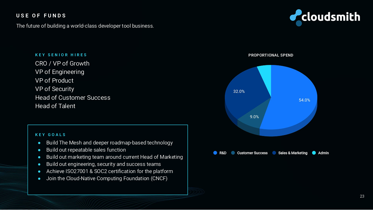
Could this half-assed financial riddle slide be any more vague? It dances around the topic of money like it’s a hot stove, vaguely hinting at how the company will spend the cash but clamming up regarding the actual amount it’s looking to raise. Here’s a tip: When you’re asking for money, don’t be shy. Spell it out, loud and clear. How much do you need? Don’t leave investors guessing or they might guess themselves right out of the meeting room.
And on that subject, ditch the percentages. They’re about as helpful as a chocolate teapot. Use hard numbers, dates and details. Say when you’re planning to make those key hires, and what these new knights in shining armor will cost you. More importantly, what dragons are they going to slay? Lay out the goals these hires will help you achieve, and please, for the love of clarity, make it specific — the how, what, when, where and why. Offer investors the roadmap, not just the destination.
Now, about those goals: You’ve got aspirations, but how are you going to turn those daydreams into reality? What needs to happen? Do you need people, tools and infrastructure? And how much will these dreams cost? Once you’ve sorted all that, dazzle with the potential benefits. What wonders will these investments work for your company? Remember, it’s all about SMART goals here: specific, measurable, achievable, relevant and time-bound. Tell the investors what they’ll get for their money, and make it clear that if you hit those goals, you’ll be able to raise a chunky Series B to keep chasing that ARR figure up and to the right.
The full pitch deck
If you want your own pitch deck teardown featured on TechCrunch, here’s more information. Also, check out all our Pitch Deck Teardowns all collected in one handy place for you!
