NOQX is a Stockholm-based startup on a mission to help companies improve their goal-setting, collaboration mechanisms and experiences. It has just raised a $200,000 pre-seed round to help accomplish its aims and, by extension, help out companies with employee counts ranging from 50 to 500 or so. The company hasn’t been around for very long — the team behind NOQX felt frustrated by a lack of effective goal management tools for companies and founded the company in 2023.
With “clarity of objectives” as its rallying cry, NOQX addresses a critical function of any business — and indeed, of pitch decks — so I was intrigued to see how well NOQX communicates this for itself.
We’re looking for more unique pitch decks to tear down, so if you want to submit your own, here’s how you can do that. Read all the Pitch Deck Teardowns here.
Slides in this deck
NOQX’s deck has 18 slides, none of which has any redactions, although the company omitted its competition slide. An 18-slide deck should cover everything (most startups do just fine with 16), but there are some omissions that leave it incomplete.
- Cover slide
- Problem slide 1
- Problem slide 2
- Problem slide 3
- Solution slide 1
- Solution slide 2
- Solution slide 3
- Onboarding (“how it works” slide)
- Landscape slide
- This Makes Us Unique slide
- Roadmap slide
- Traction slide
- Go-to-market
- Pricing
- Target customer
- Why Now? slide
- Team slide
- Closing slide
“Almost there but not quite”
In the past 90-odd installments of this Pitch Deck Teardown series, I’ve generally stuck with a “three things that are good” and “three things that can be improved” format. I tried ever so hard to do that for NOQX as well but eventually gave up.
The bold design of NOQX’s deck made me want to love it, but in truth, reviewing this deck was a deeply frustrating experience. Aside from the crucial omission of an Ask and Use of Funds slide (it’s not uncommon to get it wrong, but it should at least be included!), just about every slide in the deck felt almost very good — but then stumbled by not including a critical factor or overlooking an important detail. The deck is essentially so vague that it seems the founders don’t have a firm grip on why they are doing what they are doing.
You never need three problem slides

[Slides 2, 3, 4] That’s a lot of problem slides. Image Credits: NOQX
I was surprised to see NOQX break out three different problem slides. It is almost defensive, as if the company is desperate to convince investors that “Yes! I promise! There’s a real problem worth solving here!”
Investors are sharp. It’s far more effective to streamline this into a single, punchy slide. This approach spares everyone the boredom of repetition and sharpens the focus, ensuring the core issue shines without unnecessary fluff.
The problem slide should hit investors with a stark headline for a more compelling punch: “70% of companies are failing to achieve their goals” immediately sets the stage, signaling a significant and widespread issue. Below this headline, NOQX could have added three to five bullet points, each a mini-revelation on why this massive failure rate matters. These bullets need to pack a punch, highlighting the dire consequences for businesses and the economy, and the looming disaster if left unchecked. The idea is to make investors sit up and realize, “We can’t afford to ignore this.”
These bullet points should do more than just state the obvious; they need to align with what keeps investors up at night directly: opportunity and scalability. Each point should scream potential and profit, convincingly arguing why NOQX holds the golden ticket to a pressing, lucrative problem. By distilling the problem down to a single, impactful slide, NOQX would have cut through the noise, commanded attention, and made their case with the kind of clarity that demands a checkbook, not just a nod.
You also don’t need three solution slides
Saw this one coming, right?

[Slides 5, 6, 7] If you have too many solutions, you don’t have a solution. Image Credits: NOQX
From a storytelling point of view, it’s often worth divorcing the “solution” slide from the “product” slide. In this progression of slides, Slide 5 is kinda-mostly a solution slide, Slide 6 is kinda-sorta a value proposition slide, and Slide 7 plays the role of a product slide — but none of the slides are convincing.
Identifying the slides properly means that it becomes much easier to know what to include.
For a solution slide, it’s crucial to clearly articulate how your product or service solves the problem you’ve identified. This slide should succinctly explain why your solution is superior to existing alternatives. It’s worth keeping this part strategic and high level: You’re about to dive into the nitty-gritty on the product slide.
For the value proposition part of the story, founders must clearly define the unique benefits the product or service offers and why it stands out in the market. This slide should succinctly communicate what makes the startup’s offering valuable to potential customers and what differentiates it from competitors. It needs to highlight the distinct advantages it provides, such as cost-efficiency, superior technology, enhanced features or better user experience. In this case, NOQX’s value props are a bit of a nothingburger — fine at first glance, but not differentiated enough to really stand out from the competition.
For a product slide, you get to dive in and show the actual features and functionality that will help your customers get value from your product and solve their problem. Apart from the fact that “our awesome platform” is a bit cringe, it doesn’t actually say anything. Every startup in the world could say “our awesome platform,” which means you’re wasting that slide real estate for nothing. What is awesome about it? Why should investors care? How is it different or unique?
What is this slide trying to convey?

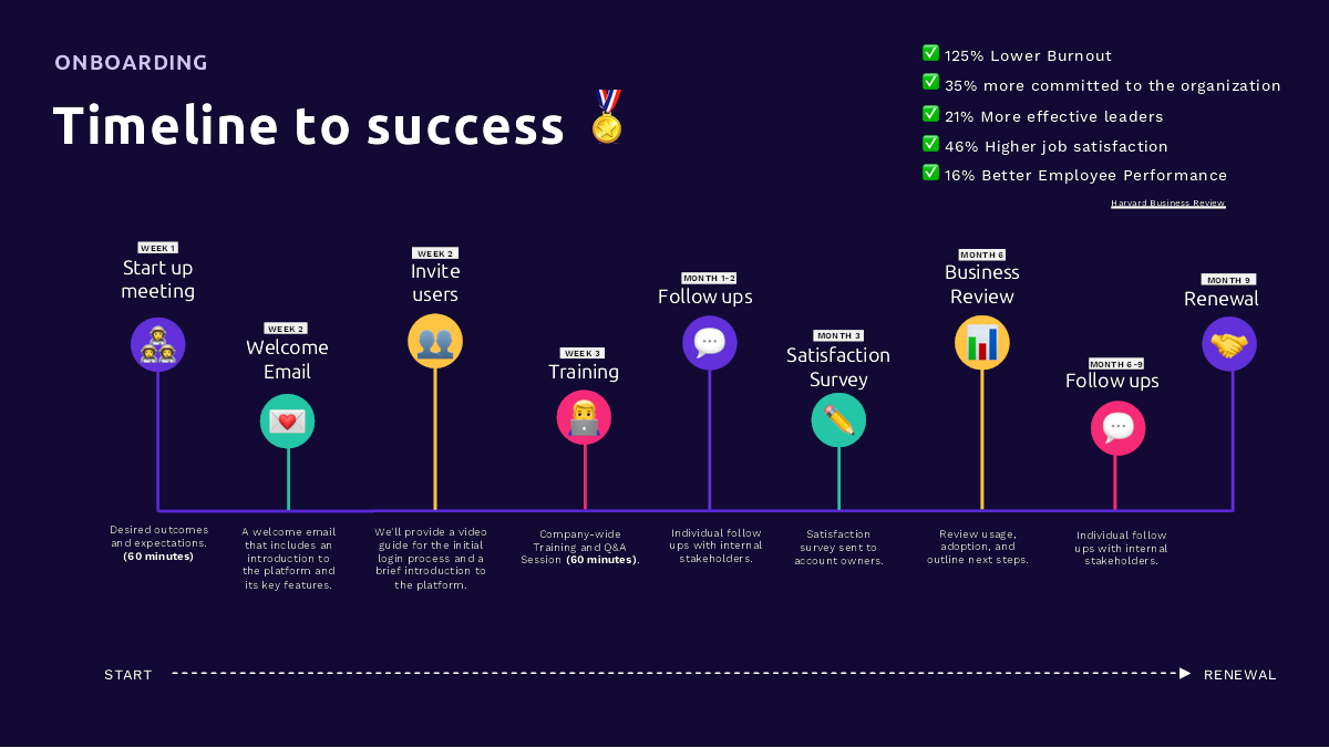
[Slide 8] A timeline to confusion. Image Credits: NOQX
I love a good timeline slide that shows what companies are trying to accomplish. Instead, this slide fails to understand who it is talking to. Perhaps this slide works in a sales deck when the founders are trying to explain its value to customers, but for an investor deck, this seems a little superfluous.
Overall, this slide falls between “how it works” and “value prop.” It’s not doing a great job at either, and it fails to meet the overall criteria for what to include in a pitch deck: Will this help you raise money? My gut sense is “no.”
This isn’t traction

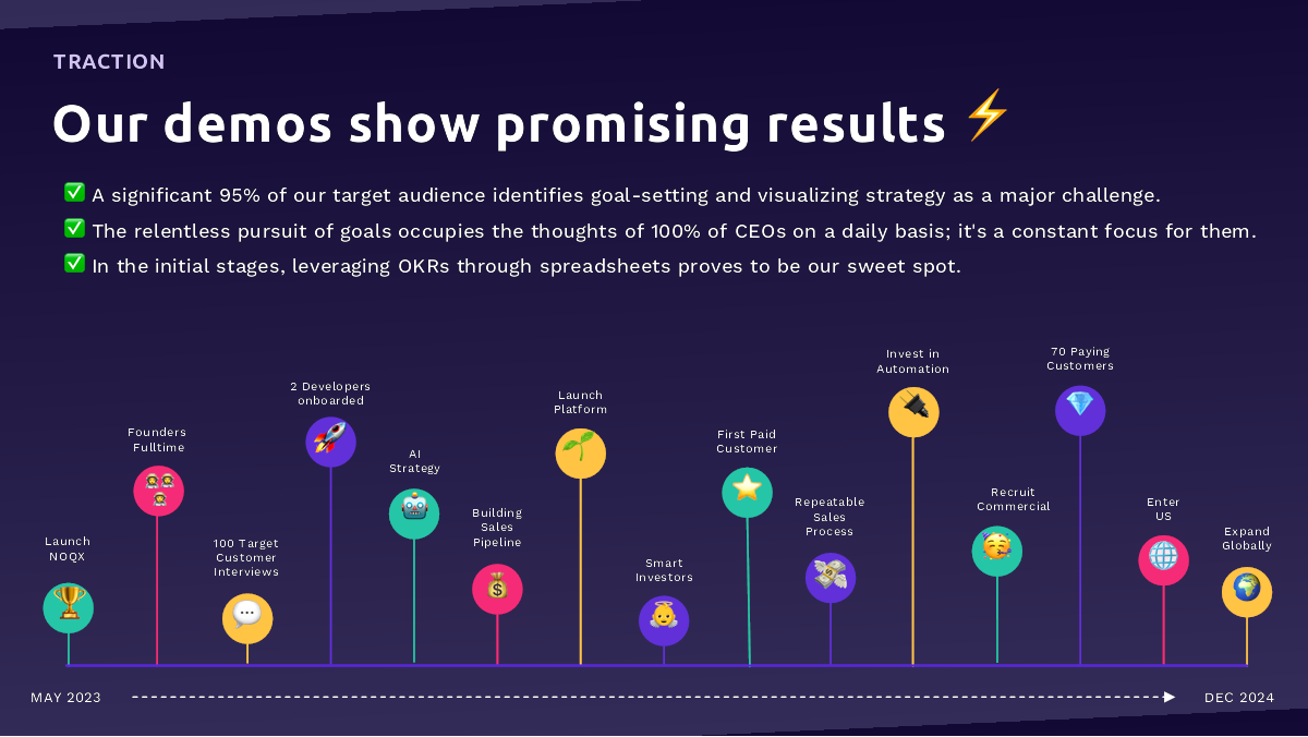
[Slide 12] Traction is the past. Image Credits: NOQX
I love how colorful and visually appealing this slide is. What it is not, however, is a traction slide.
If you don’t have revenue yet, your traction slide should outline what you’ve done to de-risk the company. This slide not only fails to do that, but it also goes to December 2024. Your traction, per definition, is just about the past: accomplishments and milestones achieved to date. Ideally it’s presented as charts and graphs that show that growth is solid and accelerating. This looks like there isn’t any traction in the business. That makes sense; it’s a young company. But don’t try to trick your investors; they’ll see right through this, so just be upfront.
But all is not lost. This slide is sort of a “use of funds” slide, showing what the company is planning to do in the near future. That would be helpful, but it should have clear time goals around when it is planning to hit those milestones and what it needs to do to get there. “Smart investors” and “repeatable sales process” are important steps along the way, but they are obvious. Investors want to know what you’re going to do to get those investors and sales processes.
Why now, indeed

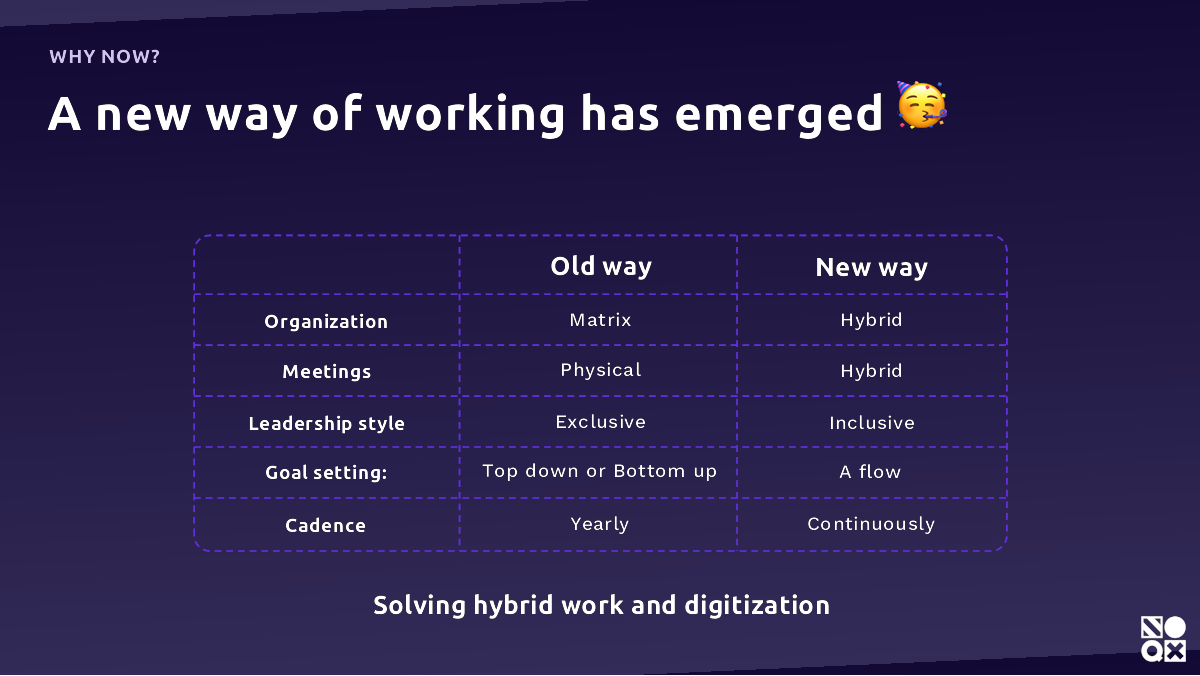
[Slide 16] Why, oh, why? Image Credits: NOQX
Having a great “Why now?” slide can help create FOMO and a sense of urgency. This slide just doesn’t do that. It’s a great start, don’t get me wrong, but well-informed investors will know all of this; it doesn’t add anything to the conversation. I’d have loved to see some insights or some thought leadership here. Why was there a shift in organizational structures? What’s the impact of meetings evolving? What is the impact of a leadership style shift? What does “a flow” goal setting and cadence even mean in this context?
I feel like I’m missing something significant here. Perhaps this slide only works when it has a voice-over, but pitch decks need to stand on their own two proverbial feet. And that might mean that you may need more than one pitch deck: one for voice-overs and one for sending ahead.
Tell me why you’re awesome!
Your team slide is crucial and is doing a lot of heavy lifting in the context of an early-stage pitch. Let’s take a look at this one:

[Slide 17] A solid team, but I want more context. Image Credits: NOQX
There’s too much and too little going on in this slide. The slide has a lot of very small text on it, which I don’t love. It’s pretty conversational, which can work, but in this case, I think it comes up short.
“With a decade of experience in hyper-growth B2B-SaaS companies.” Yes, but which ones, and why is that relevant? The rest of the statement is a lot of words, but it’s not helping me, as an investor, ascertain whether the CEO is a great fit to build this company. Now I need to head to LinkedIn, but there’s no link, so I’m going to have to start Googling, and I’m finding myself frustrated; this could be so much easier and better.
The CTO’s bio is similarly frustrating: Senior developer at Klarna is impressive, but it isn’t clear whether the experience is directly relevant or overlaps with the mission, vision and products NOQX is pursuing. The rest of the bio doesn’t say much. Yes, of course you are a visionary leader who strives to break new ground and deliver exceptional experiences, but the same can be said for every startup CTO ever. Be more specific. Explain why you’re the gold-plated unicorn on a pile of unfair advantages and talents that lead me to believe I’d be crazy not to deploy money into this startup.
And finally, if your head of UX is a co-founder, we need to have a conversation about whether that makes sense. And if she’s not, what is she doing on your team slide? As an investor at the earliest stages, I’m investing in the founding team and its ability to build a solid team. I don’t need to know the team itself quite yet.
Why so vague?

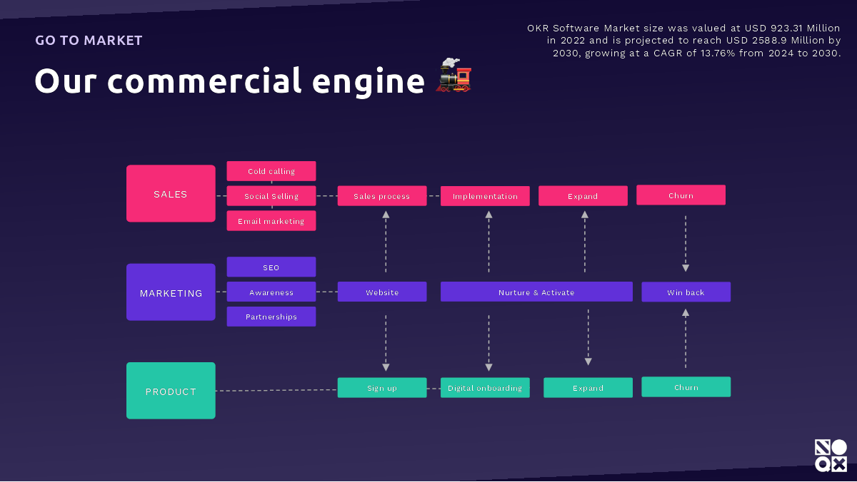
[Slide 13] This could have been copied out of a business textbook. That’s not a good thing, because all the specifics are missing. Image Credits: NOQX
Overall, the whole pitch deck seems really vague and nonspecific, which makes me (and investors) suspicious. Is it vague by accident, and if so, will this startup be able to explain what it is doing as it is growing and evolving? Worse, is it vague on purpose, because the founders know they’re not a great fit with the industry they are trying to enter?
Take this go-to-market slide, for example. This is barely even a brainstorm; it just outlines a generic sales process. Cold calling and email marketing: Yes, but where will it find its customers? What’s the top-of-funnel? What are the conversion rates?
Investors want to know who you are, what you’re doing, why you’re doing it, and how you’re thinking about the market and building a (potentially) multi-billion-dollar company in this space. They want to know who your customers are, what their existing options are and how you’re different. They want to know how you find and reach out to your customers, and they want to know how much you’re expecting to pay to acquire a customer, and how long you’re expecting them to stay around, and at what value.
None of those things are obviously present in this deck. That means that if I were to take a meeting with this startup, I’d have a lot of very pesky questions for them, such as:
- Why are you the best people in the world to start this company?
- What’s your moat / how is this defendable?
- Who are your customers, and how are you going to reach them?
- What’s the competitive landscape, and how are you different?
- What’s your business model? How will you attract, convert and retain your customers?
All in all, the deck looks so good, but it lacks substance. Hopefully the company can figure that out ahead of raising its next round, or it may be in for a truly nasty surprise.
The full pitch deck
If you want your own pitch deck teardown featured on TechCrunch, here’s more information. Also, check out all our Pitch Deck Teardowns collected in one handy place for you!
